

packaging
Complete brand creation for retail: from logo conceptualization to shelf-ready packaging..
Clients often approach with a raw product but no visual identity. My role is to transform that commodity into a distinct brand. I build the entire visual ecosystem from the ground up—defining the primary logomark, the packaging architecture, and the promotional key visuals. The goal is to establish a cohesive narrative that converts curiosity into purchase, ensuring the product commands attention on both physical shelves and digital feeds.
FMCG
Brand Creation
Labeling
Product Systems
Print Production
Key Visuals

ARTISAN SPIRITS
Starting with a nameless distillate, I developed a complete brand identity rooted in craftsmanship. The centerpiece is a label architecture focused on variable data—dedicated spaces for handwritten batch numbers and dates—which institutionalizes the "human touch." Beyond the bottle, I established a visual tone for the brand's imagery, creating a system of key visuals that validate the artisanal quality of the product.



WILK COMPANY
QUINCE LIQUEUR
LABEL AND VISUALS:
MORE DESIGN
2024

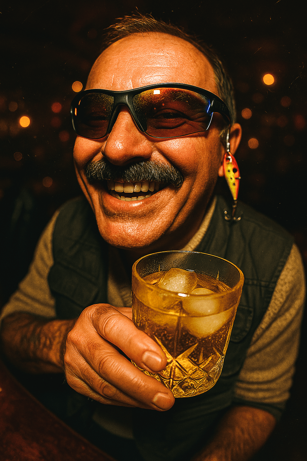
Quince liqueur is culturally pigeonholed as a quiet, traditional drink for the older generation. The visual strategy hacks this stereotype by keeping the demographic but radically shifting the context.
I placed the typical consumers—aunts and uncles—into a chaotic, high-energy house party scenario usually reserved for 20-somethings. Using raw, high-flash photography, we reframed this traditional spirit as a fuel for uninhibited, ageless nightlife, proving it belongs at a rave just as much as it does at a family dinner.


WELLNESS ARCHITECTURE
I delivered a total brand creation package, starting with a custom, vertically condensed typographic logomark. The visual identity is anchored by a lion illustration-selected as the central key visual to reflect its cultural significance as a symbol of strength and fortune in India.
The critical challenge was typographic engineering. With a 15-SKU lineup, I had to structure extensive regulatory data onto minimal surface areas without resorting to multi-layer peel-off labels. I achieved this through a rigorous micro-grid system and a bold color-coding taxonomy, ensuring legibility and brand cohesion across the entire shelf.


packaging
Complete brand creation for retail: from logo conceptualization to shelf-ready packaging..
Clients often approach with a raw product but no visual identity. My role is to transform that commodity into a distinct brand. I build the entire visual ecosystem from the ground up—defining the primary logomark, the packaging architecture, and the promotional key visuals. The goal is to establish a cohesive narrative that converts curiosity into purchase, ensuring the product commands attention on both physical shelves and digital feeds.
FMCG
Brand Creation
Labeling
Product Systems
Print Production
Key Visuals
ARTISAN SPIRITS
Starting with a nameless distillate, I developed a complete brand identity rooted in craftsmanship. The centerpiece is a label architecture focused on variable data—dedicated spaces for handwritten batch numbers and dates—which institutionalizes the "human touch." Beyond the bottle, I established a visual tone for the brand's imagery, creating a system of key visuals that validate the artisanal quality of the product.
WILK COMPANY
QUINCE LIQUEUR
LABEL AND VISUALS:
MORE DESIGN
2024
Quince liqueur is culturally pigeonholed as a quiet, traditional drink for the older generation. The visual strategy hacks this stereotype by keeping the demographic but radically shifting the context.
I placed the typical consumers—aunts and uncles—into a chaotic, high-energy house party scenario usually reserved for 20-somethings. Using raw, high-flash photography, we reframed this traditional spirit as a fuel for uninhibited, ageless nightlife, proving it belongs at a rave just as much as it does at a family dinner.
WELLNESS ARCHITECTURE
I delivered a total brand creation package, starting with a custom, vertically condensed typographic logomark. The visual identity is anchored by a lion illustration-selected as the central key visual to reflect its cultural significance as a symbol of strength and fortune in India.
The critical challenge was typographic engineering. With a 15-SKU lineup, I had to structure extensive regulatory data onto minimal surface areas without resorting to multi-layer peel-off labels. I achieved this through a rigorous micro-grid system and a bold color-coding taxonomy, ensuring legibility and brand cohesion across the entire shelf.
packaging
Complete brand creation for retail: from logo conceptualization to shelf-ready packaging..
Clients often approach with a raw product but no visual identity. My role is to transform that commodity into a distinct brand. I build the entire visual ecosystem from the ground up—defining the primary logomark, the packaging architecture, and the promotional key visuals. The goal is to establish a cohesive narrative that converts curiosity into purchase, ensuring the product commands attention on both physical shelves and digital feeds.
FMCG
Brand Creation
Labeling
Product Systems
Print Production
Key Visuals
ARTISAN SPIRITS
Starting with a nameless distillate, I developed a complete brand identity rooted in craftsmanship. The centerpiece is a label architecture focused on variable data—dedicated spaces for handwritten batch numbers and dates—which institutionalizes the "human touch." Beyond the bottle, I established a visual tone for the brand's imagery, creating a system of key visuals that validate the artisanal quality of the product.
WILK COMPANY
QUINCE LIQUEUR
LABEL AND VISUALS:
MORE DESIGN
2024
Quince liqueur is culturally pigeonholed as a quiet, traditional drink for the older generation. The visual strategy hacks this stereotype by keeping the demographic but radically shifting the context.
I placed the typical consumers—aunts and uncles—into a chaotic, high-energy house party scenario usually reserved for 20-somethings. Using raw, high-flash photography, we reframed this traditional spirit as a fuel for uninhibited, ageless nightlife, proving it belongs at a rave just as much as it does at a family dinner.
WELLNESS ARCHITECTURE
I delivered a total brand creation package, starting with a custom, vertically condensed typographic logomark. The visual identity is anchored by a lion illustration-selected as the central key visual to reflect its cultural significance as a symbol of strength and fortune in India.
The critical challenge was typographic engineering. With a 15-SKU lineup, I had to structure extensive regulatory data onto minimal surface areas without resorting to multi-layer peel-off labels. I achieved this through a rigorous micro-grid system and a bold color-coding taxonomy, ensuring legibility and brand cohesion across the entire shelf.